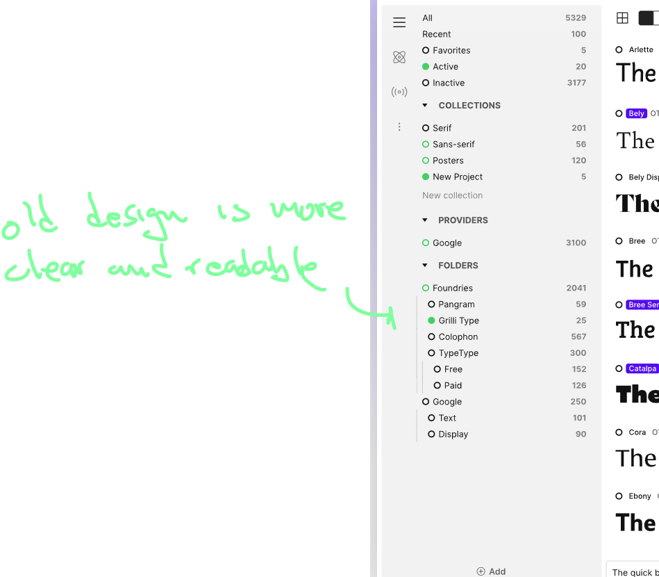
In prior versions and we can also see on the main home page. The Fonts list and especially the sub-items, where much more clear.
Ive noticed since the latest update, there is hardly any different with sub items in a list. The indent is to small. Making if unclear if something is a folder. Normally that folder toggle is on the left or at least its more clear
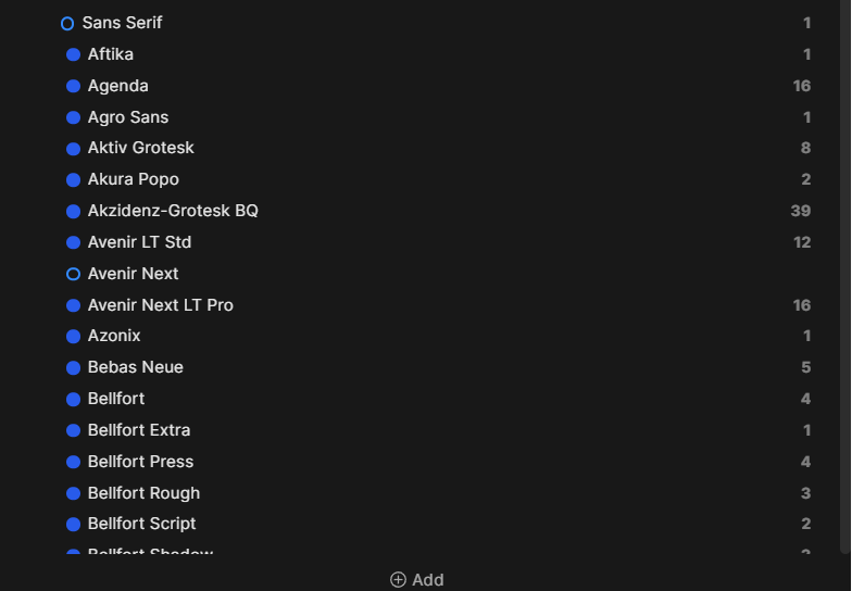
Old design is more clear, indent is bigger. Also the vertical “folder open” line is more distinguishable