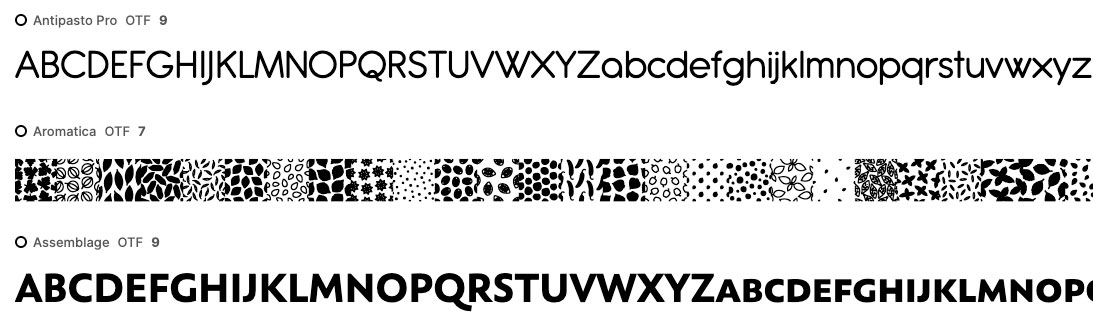
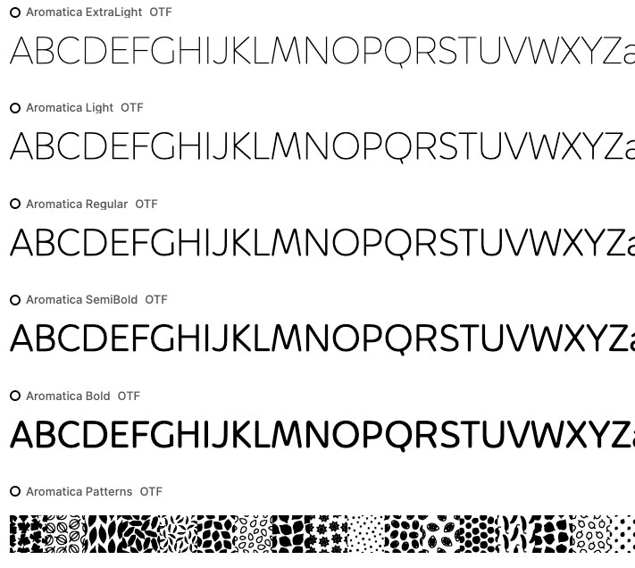
I would love to be able to choose which font is displayed to showcase the family (when I have the option ‘Group fonts into families’ selected).
Sometimes, especially for big font families, the font choosed by the software to display the grouped family isn’t representative of the font family (a very light or bold weight, condensed or extended for example). It would be nice to be able to manually change that, maybe with right-clicking on the wished font and press a button like “choose to display the family”.
If it’s not technically possible, maybe make it always (or the most of the time) display the ‘regular’ font ?
Hi, @_thibault, thank you for your message and welcome to the forum.
It might be possible. As this request is already in the Greenlight category, let’s see if it gets any traction with the community.
With enough support it will most likely be included in one of the future releases.
Yuriy
FontBase Dev Team
In this example, the “Antique Olive Std” family is displayed by the ‘Bold Condensed’ style instead of the ‘Roman’ which would be excepted.
The reason behind this request is mainly to compare similar font families in a simpler way (no need to click on the family to scroll to the desired font).
Finally, with a button like “choose to display the family”, we could change the displayed font as wanted for different usages (e.g. compare bolder or lighter weights).
I joined to add my support to this request. I keep getting bold chosen for some displayed fonts and the whole point of this program for me is to compare select fonts. It’s not very helpful when it’s forcing me to look at different weights.
+1 THIS! My interpretation of the issue is with Family management. Some fonts are ingested and categorized as a “family of one”, which means all font weights are displayed individually in the main fontbase window. Other families are grouped together and only display a single preview of the first weight. I would prefer to see all weights right there in the fontbase window, so I can scroll down and see what I’m looking for. I can understand the appeal of previewing only one weight of a family to keep things tidy, but that is not very useful when you are always shown “Light Italic” and have to drill down into numerous families to find what you were looking for.
Hello @johnny, thank you for your post and welcome to the forum
If I understood your message correctly, it seems the main issue you’re facing is different from what the topic is about. Sometimes font grouping is out of whack indeed, and the main reason for this is that font designers and coders sometimes incorrectly input font data inside the font files they create. At one point we did actually have a bug in the app that caused incorrect grouping, but it has been fixed a quite while ago.
Thanks for the quick response! My message is a “yes, and” on OP’s issue -
Fonts that are correctly “collapsed” into families tend to display an arbitrary weight as the preview, which is less than ideal when browsing (OP’s claim).
This issue is exacerbated by the fact that the “collapsed family” preview is, itself, not ideal when they are mixed in with other families that are incorrectly “uncollapsed”, broken out into long lists.
Example: I have many large families that Fontbase “incorrectly” displays as “uncollapsed”, displaying all weights in a long list (I actually prefer this view, as I can quickly scroll and see everything without having to click in).
Scattered among these long lists are the “collapsed families” which only display “Thin Italic” or some other random weight. These “collapsed families” (with random previews), buried among long lists of “uncollapsed families” are easily overlooked. It leads to a lot of frustrated clicking around, vs the pleasurable experience of simply scrolling through the collections we have meticulously assembled.
My “yes, and” request is that it would be great to:
A) choose which weight is assigned to the family preview (OP’s request), and/or
B) choose whether Fontbase displays families as “uncollapsed” (full list) or “collapsed” (single preview). Even if we can’t choose the default preview weight, at least then we wouldn’t be left having to memorize what is buried inside each family.